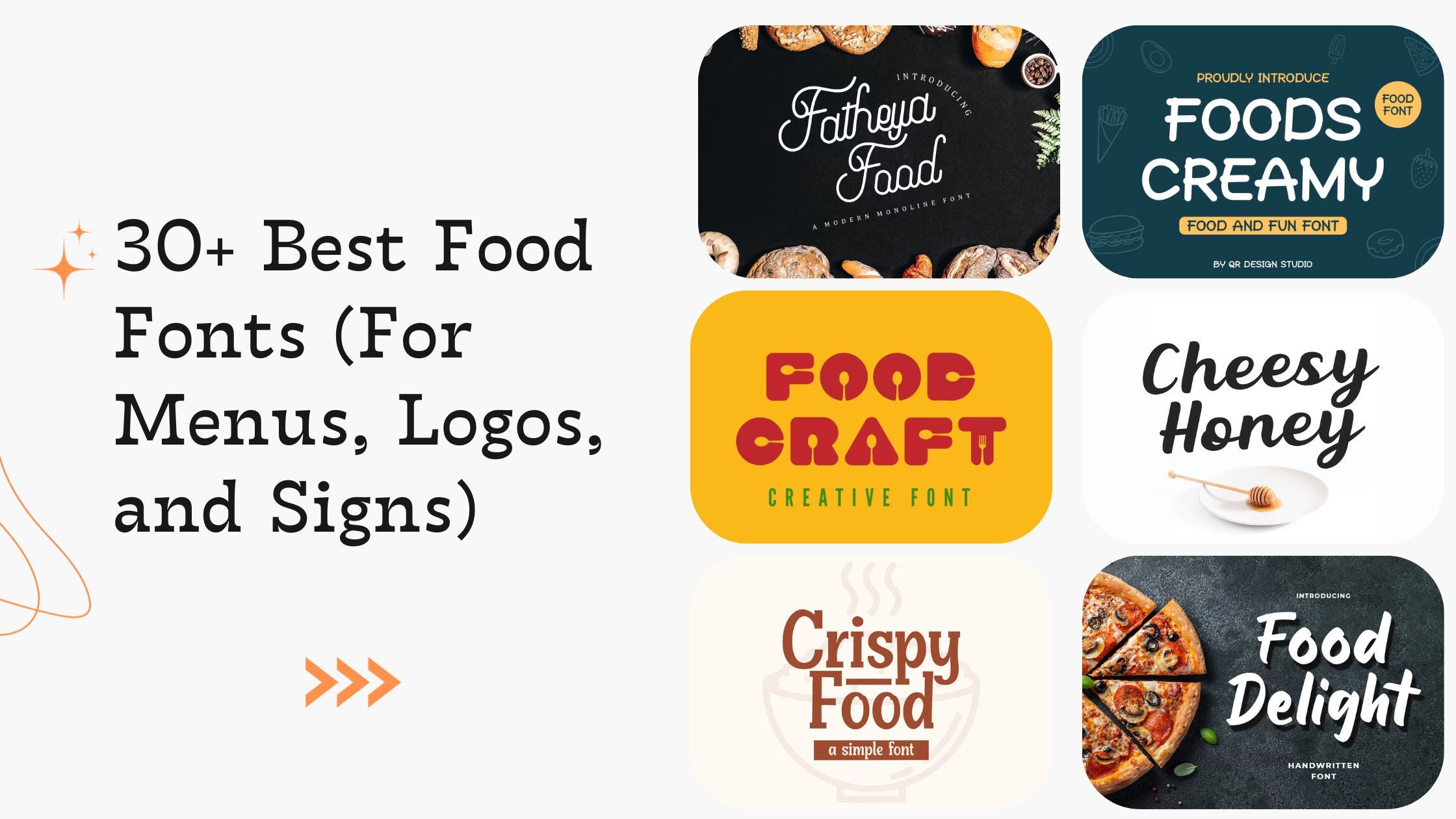
Enhancing Your Food Designs with Fonts
To make the most of your chosen food fonts, here are additional strategies to effectively integrate them into your design projects:
Create a Cohesive Brand Identity
Fonts are a crucial component of brand identity. Consistent use of fonts across various platforms—menus, websites, social media, and packaging—helps in building a recognizable and cohesive brand image. For instance, if you’re using Bebas Neue for your restaurant menu, maintain that font style for your website headings and promotional materials to ensure brand consistency.
Leverage Font Pairing
Combining fonts can enhance the visual appeal of your food-related designs. Pairing a decorative font with a simple, readable one can create a dynamic and engaging layout. For example, you might use Lobster for headings to add a playful touch and Quicksand for body text to ensure readability. Font pairing can help draw attention to important elements while maintaining overall design harmony.
Optimize for Digital and Print
Different mediums require different font treatments. Ensure that your fonts are legible and visually appealing in both print and digital formats. Test your fonts on various devices and print prototypes to confirm that they retain their quality and readability. For example, Montserrat works well on digital screens due to its clean design, while Playfair Display offers a classic look that translates well to print.
Incorporate Font Variations
Many fonts come with multiple weights and styles, such as regular, bold, italic, and light. Utilize these variations to add emphasis and create visual interest. For example, using Raleway Bold for headings and Raleway Light for body text can create a clear hierarchy and make your content more engaging.
Consider Accessibility
Accessibility is an important aspect of design. Ensure that your fonts are easy to read for all users, including those with visual impairments. Choose fonts with clear, distinct letterforms and avoid overly complex or ornate styles that may be difficult to read. Quicksand and Montserrat are excellent choices for their legibility and straightforward design.
Use Fonts to Set the Mood
Fonts have the power to set the tone and mood of your content. For instance, if you’re designing a menu for a fine dining restaurant, using an elegant font like Playfair Display can convey sophistication. Conversely, a casual font like Pacifico can create a relaxed and fun atmosphere for a family-friendly restaurant.
Experiment with Custom Fonts
If you want a truly unique look, consider creating a custom font or modifying an existing one. Custom fonts can help you stand out from the competition and create a distinctive brand identity. Work with a professional designer to develop a font that aligns with your brand’s personality and design goals.
Examples of Food Font Applications
To illustrate the impact of fonts in food design, here are some practical examples of how different fonts can be used effectively:
Restaurant Menus
- Bebas Neue: Use this bold font for main menu headings and special offers to attract attention and create a clean, modern look.
- Playfair Display: Apply this elegant serif font for descriptions and detailed menu items to add a touch of sophistication.
Food Blogs
- Lobster: Utilize this cursive font for blog titles and featured recipes to create a friendly and inviting atmosphere.
- Quicksand: Use this modern sans-serif font for body text and recipe instructions to ensure clarity and readability.
Food Packaging
- Montserrat: Employ this versatile font for labels and packaging text to convey a contemporary and professional image.
- Pacifico: Add this playful font to packaging designs for snacks or treats to create a fun and approachable vibe.
Social Media Graphics
- Raleway: Use this stylish font for social media posts and promotions to maintain a sophisticated and polished appearance.
- Bebas Neue: Apply this font for eye-catching headlines and announcements to drive engagement and capture attention.
Selecting the right font for your food-related projects is more than just a design choice; it’s an integral part of how your brand communicates with its audience. By understanding the characteristics of different fonts and their applications, you can make informed decisions that enhance your brand’s visual identity and effectiveness.
From modern and clean fonts like Montserrat to playful and inviting styles like Pacifico, the right font can elevate your culinary creations and make a lasting impression on your audience. Experiment with different fonts, pair them thoughtfully, and ensure they align with your brand’s identity and message.
With the right approach, your food designs will not only look visually appealing but also convey the essence of your culinary offerings with style and flair. Embrace the power of fonts to transform your food-related projects and engage your audience in a meaningful and impactful way.
FAQs About Food Fonts
What are food fonts?
Food fonts are typefaces specifically chosen or designed to enhance the visual appeal and readability of food-related content. They are used in various applications such as restaurant menus, food packaging, blogs, and promotional materials to convey the personality of the brand and improve the overall design.
Why is it important to choose the right font for food-related designs?
The right font can significantly impact the effectiveness of your food-related designs. It helps establish brand identity, attracts the target audience, enhances readability, and sets the overall tone of the design. A well-chosen font can make menus, packaging, and digital content more engaging and visually appealing.
What characteristics should I look for in a food font?
When selecting a food font, consider characteristics such as readability, style, personality, and versatility. The font should be easy to read, match the brand’s identity, and work well across different mediums. Additionally, it should be visually appealing and complement the overall design.
Can you give examples of fonts suitable for different types of food-related content?
Certainly! For upscale restaurants, fonts like Playfair Display or Raleway offer sophistication. For casual dining or food blogs, fonts like Pacifico or Lobster can add a friendly and inviting touch. Modern applications might benefit from fonts like Montserrat or Quicksand for a clean, contemporary look.
How can I pair fonts effectively in food-related designs?
Pairing fonts involves combining a decorative font with a simpler one to create a balanced and visually engaging design. For example, use a bold font like Bebas Neue for headings and a clean, readable font like Quicksand for body text. Ensure the fonts complement each other and maintain overall design harmony.
Are there any tips for ensuring my food fonts are accessible?
To ensure accessibility, choose fonts with clear, distinct letterforms and avoid overly decorative styles that may hinder readability. Test your fonts in various sizes and formats to confirm they are legible for all users, including those with visual impairments.
How can I create a unique brand identity with fonts?
Creating a unique brand identity involves selecting fonts that reflect your brand’s personality and values. Consistently using these fonts across different platforms, such as menus, websites, and social media, helps establish a cohesive and recognizable brand image. Consider custom fonts if you want a truly distinctive look.
What should I consider when using fonts in both digital and print formats?
Fonts need to be optimized for both digital and print formats. Ensure that they are legible and visually appealing on various devices and in different print sizes. Test your chosen fonts in different settings to ensure they retain their quality and readability.
Can I modify or create custom fonts for my food brand?
Yes, creating or modifying custom fonts can help you achieve a unique look for your food brand. Custom fonts can set you apart from the competition and align closely with your brand’s identity. Work with a professional designer to develop a font that meets your specific needs.
How can I stay updated with font trends in the food industry?
To stay updated with font trends, follow design blogs, participate in design forums, and keep an eye on industry publications. Trends can evolve, so regularly reviewing current design practices and experimenting with new fonts can help ensure your food designs remain fresh and relevant.
Get in Touch
Website – https://www.webinfomatrix.com
Mobile - +91 9212306116
Whatsapp – https://call.whatsapp.com/voice/9rqVJyqSNMhpdFkKPZGYKj
Skype – shalabh.mishra
Telegram – shalabhmishra
Email - info@webinfomatrix.com